Most business websites are brochures. They describe the company, list the services, and provide a contact page. They aren't wrong exactly, but they're passive. They wait to be read.
A lead generation website is built around a single job, which is turning an anonymous visitor into somebody you can actually talk to. That's a different design problem, and it changes almost every decision.
Decide Who the Site Is For
This sounds obvious and is skipped constantly. A site that tries to speak to everybody speaks compellingly to nobody, because the language has to get vague enough to cover every case.
Pick the customer you want more of. Write to that person specifically. You'll lose a little relevance for everyone else and gain a great deal with the group that matters, which is a trade worth making almost every time.
We rebuilt Bakken Property Management entirely around this. Property management sites are usually built for tenants looking for a unit, but the customer worth winning is the owner of the building. Once that was settled, every section had an obvious job: what we do for you, why investors choose us, what results look like. The audience decision did most of the work.
Give Every Page One Job
The instinct is to offer everything at once. Call us, or email, or book, or download the guide, or follow us. Presented with five options of similar weight, most people choose none of them.
Decide what you want a visitor to do on each page, make that action the most visually obvious thing there, and let everything else be secondary. One primary action, repeated as the page goes on, outperforms a menu of equally weighted choices consistently.
Answer the Question in the First Screen
A visitor arriving from a search has one question, which is whether they're in the right place. If the top of the page doesn't answer it in a couple of seconds, they leave and try the next result.
The top of a page should make three things clear immediately.
- What you do, in plain language rather than positioning.
- Who it's for, including where you work if that matters.
- What to do next.
Clever headlines that require a second read cost more than they gain. Clarity beats personality here.
Lower the Risk Before You Ask
Nobody contacts a business they're unsure about. Everything that makes you look real reduces the risk of reaching out.
- Photographs of actual work rather than stock images.
- Reviews with real names attached.
- A clear explanation of what happens after somebody gets in touch.
- Pricing, or at least a range, because silence on price reads as expensive.
- Evidence you've handled situations like theirs before.
That fourth point is underrated. A lot of people hesitate to call because they don't know what they're committing to. Saying plainly that the first step is a fifteen minute conversation with no obligation removes a genuine obstacle.
Make the Form Shorter Than You Want To
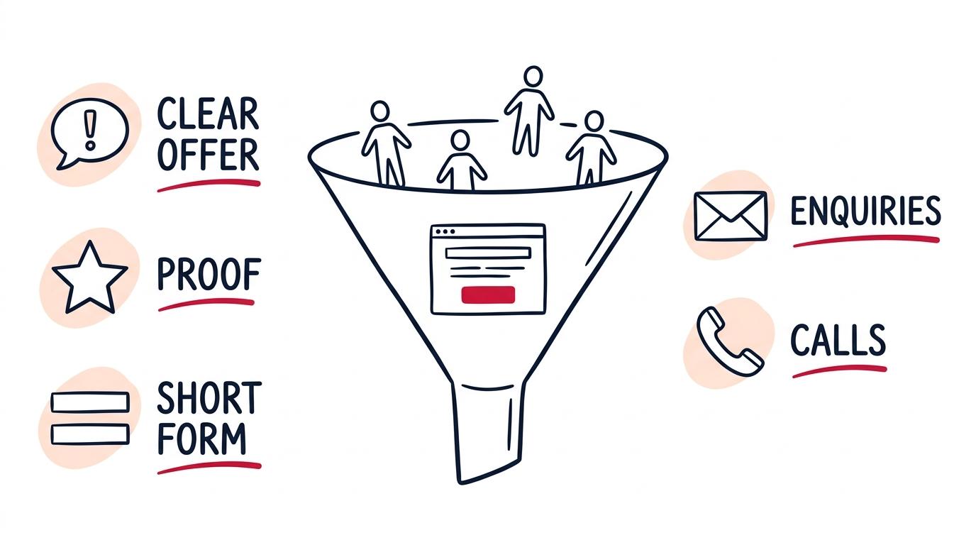
Every additional field costs completions. The temptation is to gather enough on the first contact to qualify the lead properly, but the information is worthless if the person abandons the form.
Ask for what you need to start a conversation and nothing more. Usually that's a name, one way to reach them, and a sentence about what they need. Everything else can be asked once you're talking.
Also give people a choice of channel. Some will call, some will never call and will happily fill in a form, and losing either group for lack of an option is avoidable. Utah Powersport Pros is a mobile repair operation where the same principle applied, with scheduling and a phone number both present on every screen, because riders split cleanly between people who want to book instantly and people who want to ask a question first.
Speed and Phones Decide More Than Design Does
Most visitors arrive on a phone, often on a patchy connection, and frequently while doing something else. A site that takes several seconds to become usable loses a meaningful share of them before they've seen anything at all.
This is unglamorous and it outranks most design decisions in actual impact.
- Compress images properly. Oversized photographs are the single most common cause of a slow site.
- Make sure buttons and form fields are comfortable to tap, not just technically reachable.
- Make phone numbers tappable so calling takes one action.
- Test on an actual phone on mobile data rather than on a desktop browser window made narrow.
That last one exposes problems nothing else does. A site that feels instant on office wifi can be genuinely painful on a phone three bars down, and that's the condition a lot of your visitors are in.
Find Out Where the Leads Are Leaking
When a site underperforms, the failure is usually at one specific point rather than spread evenly. Working out which point turns a vague redesign into a targeted fix.
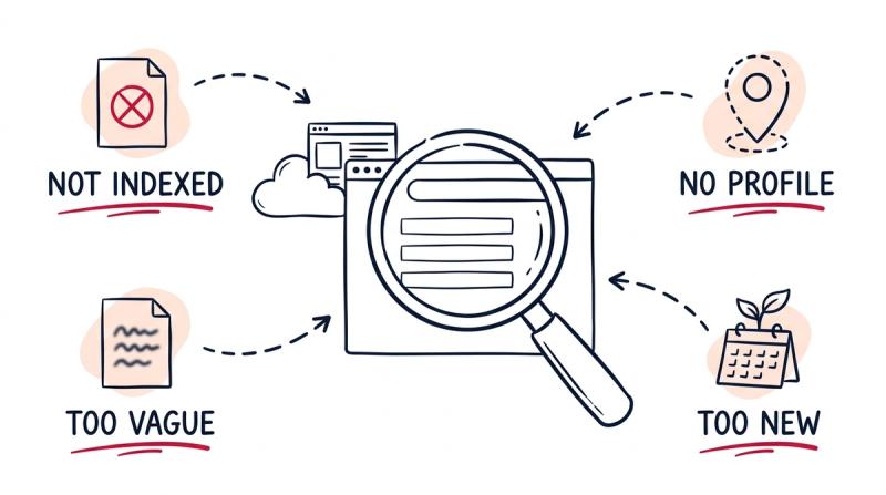
There are only a few places it goes wrong. People aren't arriving at all, which is a visibility problem rather than a site problem. They arrive and leave immediately, which usually means the page didn't match what they searched for. They read and don't act, which points at weak proof or an unclear next step. Or they start the form and abandon it, which almost always means it asks too much.
Each of these has a different remedy, and guessing wrong is expensive. A business that redesigns its homepage when the real issue is that nobody can find the site has spent money without touching the problem.
Match the Page to the Search
Somebody searching for a specific service should land on a page about that service, not on a homepage that mentions it among eleven others. Sending all traffic to the homepage and expecting people to navigate is where a lot of otherwise good sites lose leads.
This means building a page per service, and a page per area if you serve several. It's more work up front and it does two things at once, giving search engines something specific to rank and giving visitors a page that matches what they were looking for. If your pages aren't being found at all yet, that's a separate problem worth diagnosing first.
Make It Easy to Contact You on Their Terms
People differ in how they're willing to make first contact, and a site that supports only one route quietly discards everyone who prefers another.
Some will call, and for them the number needs to be visible on every screen and tappable on a phone. Some will never call under any circumstances and want a form. Some want to book a time themselves without speaking to anyone first, which is why scheduling links convert well for consultative work. Some will text, particularly younger customers and trades.
You don't need all of these. You do need more than one, and you need whichever you offer to actually work. Test your own form monthly. Broken contact forms are startlingly common, and the failure is silent, because the people affected simply assume you didn't care to reply.
Then Watch What Actually Happens
Once it's live, the guessing should stop. Track how many people arrive, how many reach a service page, and how many make contact. The drop off between those numbers tells you exactly where the site is failing, which is far more useful than opinions about the design.
The pattern underneath all of this is straightforward. Pick an audience, give them one obvious thing to do, prove you're worth the risk, and make the last step easy. That's most of what separates a site that generates leads from one that simply exists, and it's what we're actually building toward when we take on web design work.